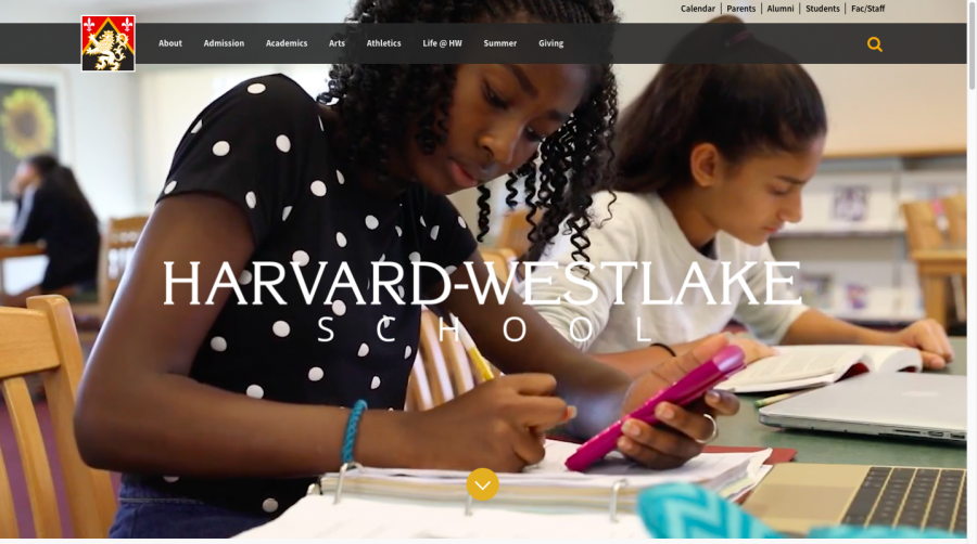
The Communications Office worked with the IT group, led by Web Manager Lillian Contreras, to redesign the school’s official website. The design team spent the last few years planning the revamp of the site, which hadn’t been redesigned in almost a decade, as a scheduled “face lift.”
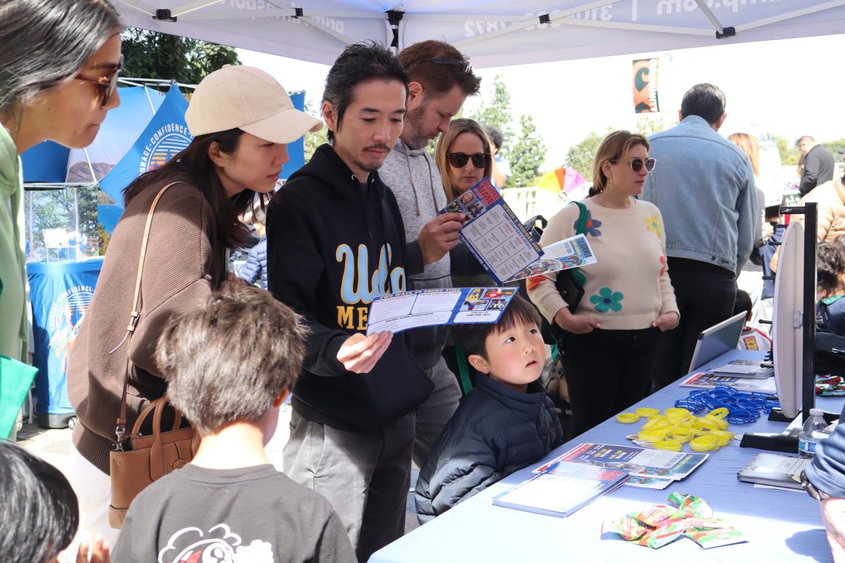
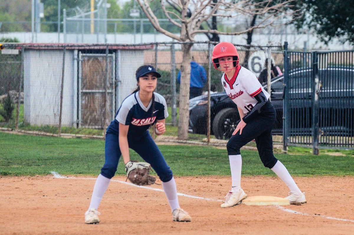
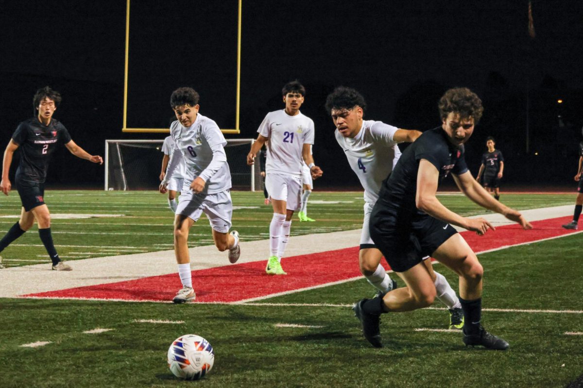
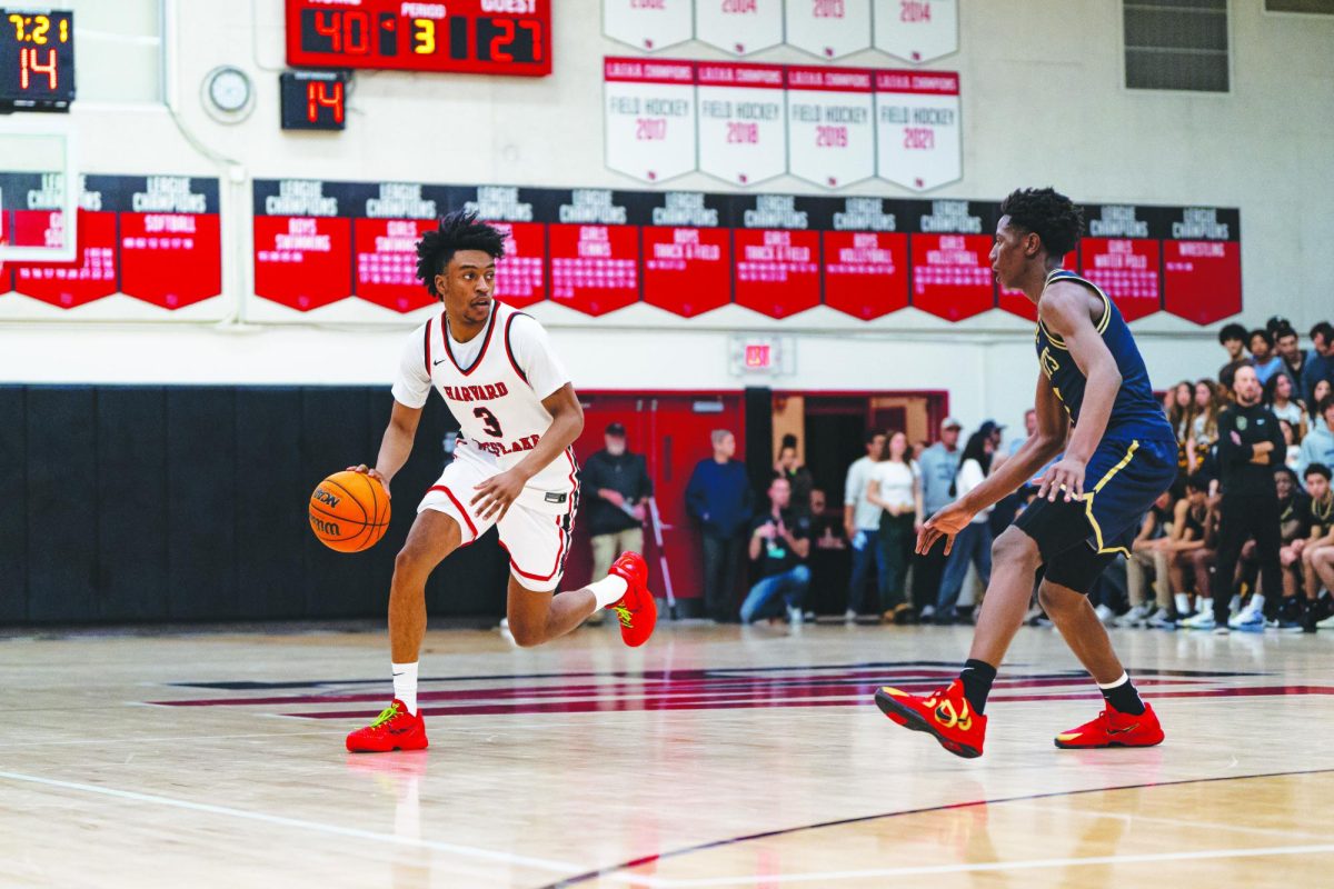
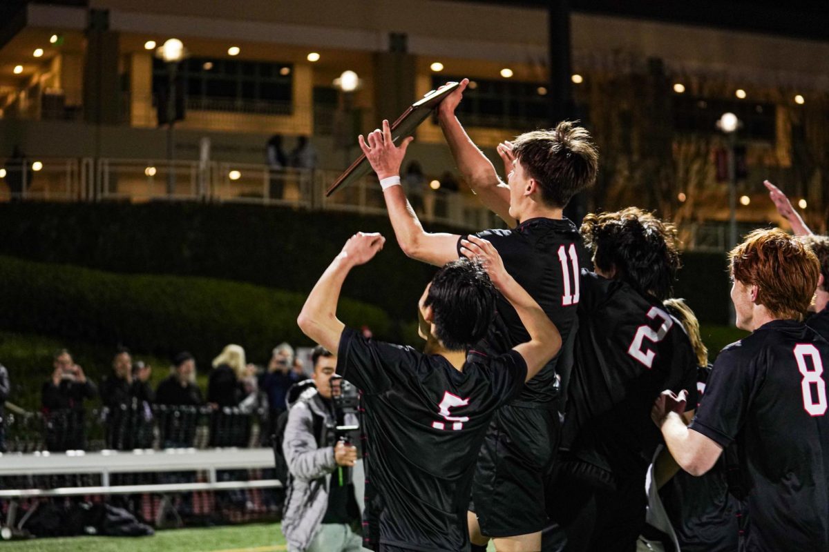
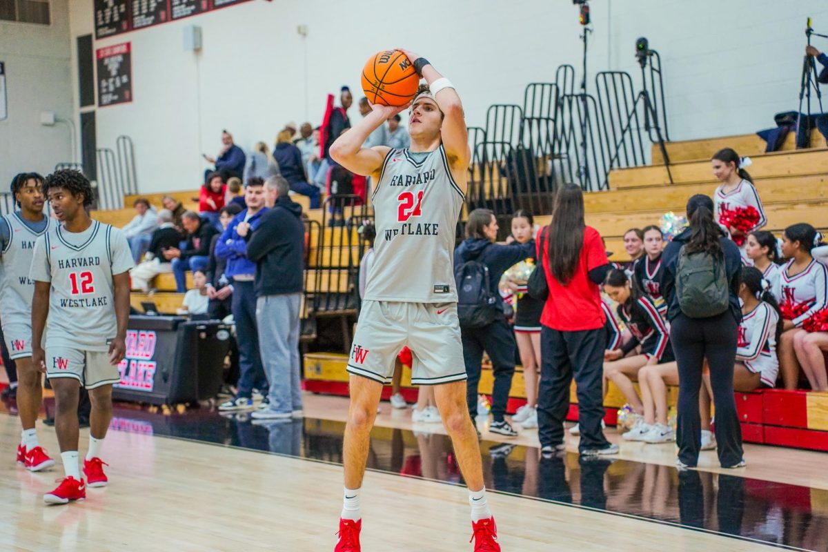
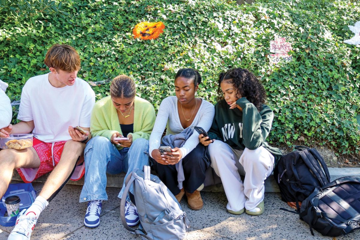
“We are doing some rebranding work at HW and want the new website to reflect that branding,” Head of Communications and Strategic Initiatives Ari Engelberg ’89 said. “We also want to use the website to tell the ‘story’ of HW in a new and fresh way. So, we’re using a lot more large-format photography, video, and social media content to keep the site dynamic and current.”
Members of the community noticed the new changes, and students vocalized their appreciation of the redesign due to its more streamlined features and its focus on visuals.
“The accessibility of the new website makes it a lot easier to navigate,” Stephenie Cho ’19 said. “The new design is really clean. I think it’s clean-cut and modern.”
However, the design team reiterated that the website’s redesign is only meant to complement the school’s image, not to represent it.
“I don’t think a website really determines a school’s image,” Engelberg said. “The image of our school is formed by the stories that students, parents, and alumni tell about the experiences they have here.”


